Blogger: Janet Kobobel Grant
Buzzfeed put together a book cover quiz that is entitled, “The Hardest Book Cover Quiz You’ll Ever Take.” Not one easily daunted by a little challenge, I immediately set about taking the quiz.
One aspect of the test that I really liked is that it’s a great tool to learn what makes for a strong book cover. Before reading more of my post, I’d suggest you hop over to Buzzfeed here and take the quiz. Then come back, and let’s talk about it. And compare scores!
…What did you think? The hardest cover quiz you’ve ever taken?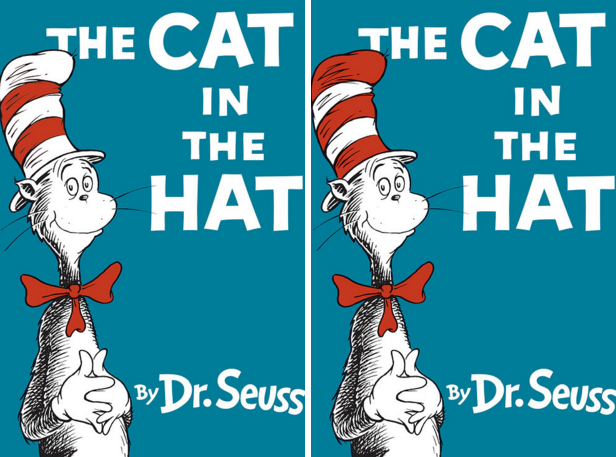
When I saw the first set of covers, The Cat in the Hat, I was startled at their similarity. I recalled taking IQ tests as a kid in which you pick one graphic out of a bunch of almost lookalikes. And that’s really what this quiz is about–picking out subtle differences in designs. Eventually, since I hadn’t read all these books (and I’m pretty sure the version of Catcher in the Rye that I read as middle-schooler had a different cover), I started picking the cover that I thought was the stronger of the two, in hopes the publisher and I agreed. To be clear, the publishers most likely didn’t have these sets of covers to make their decisions. But sometimes cover choices really do come down to small variations.
We’ll get to how I did on the quiz in a minute. But before I reveal my score, I want to use this quiz to examine what makes a cover, even with minor adjustments, work well.
For Boy Snow Bird, I chose the cover on the left because I thought the snake insinuating itself around the letters made for a more interesting design and also suggested a touch of danger in that slithering creature. Turns out that was the cover design chosen. The other cover seems flat in comparison, with the images layered on top of each other rather than interconnecting.
For the Tampa cover, I chose the one on the right because the title is bolder in black than in pink. It’s important for a title’s cover to be easily read, even from a bit of distance in a bookstore. I happened to pick correctly.
I missed A Girl is a Half-formed Thing, picking the cover on the right because I thought having the first “A” upside down was asking too much of the reader. Apparently the publishing team didn’t agree with me. Looking at the covers again, I can see, from a designerly eye, that the odd “A” actually balances the other words in the title better. Little details can make a larger impact than one would think.
With the American Psycho choices, I went with the yellow tie version. I thought the red tie didn’t highlight the yellow lines in the rest of the graphic. So I chose the version that I thought worked better artistically. Bingo! Got that one right.
Several of the covers had such minor differences, I honestly couldn’t figure out which one the publisher selected. For those, I went with the one that seemed to have the greatest clarity of lines and color. What elements did you use to make a choice?
Wolf Hall’s cover was a bit of a guess for me. I knew I needed to choose the one with the Tudor rose, but I couldn’t recall what color that would be. I happily selected the one on the right. I appreciate that the designer went with a subtle image to say “Tudor.” Every image on a cover must convey an idea about the book or evoke an emotion that matches the content.
For Catch 22, I pondered awhile before selecting the cover on the left. I chose it because I thought the airplane was more subtle and could easily be missed–sort of like a sly joke–which matched the tone of the book. I guessed correctly!
To Kill a Mockingbird needed a bird on the cover, I figured. Turns out many editions do portray a bird in a tree–but not the 50th edition, which this is the cover for. Missed this one. I still think I made the best choice, though.
For A Clockwork Orange, I went with the orange background cover. I thought it made for a more startling cover and therefore was a better match to the book’s content. I was right.
With The Luminaries, I chose the torn edges of the images rather than the clean-cut version. To me, it gave more a feel of luminaries and the fuzzy edges of the story. The designer and I saw this the same way.
Catching Fire’s better cover was, in my opinion, the one with the white title. I thought it made the title pop more. Once again, I made my choice based on the title standing out most graphically. Turns out that was the correct choice.
With Half of a Yellow Sun, I had a hard time choosing. The cover on the left made the title easier to read, but it didn’t make sense to me that a cover about a yellow sun would have such cool colors. I didn’t care for the cover on the right because the yellow yarn made the “Half” hard to read. But I went with that one. I thought I was selecting between two not-the-best covers. The publisher chose the one on the right as well.
For Catcher in the Rye, I went with the cover in which Salinger’s name is black. I thought it made the name stand out more and tied in nicely with the black lines in the cover. Apparently the publisher agreed.
Citizen’s cover is a puzzler. I couldn’t find a version of it that stated it was a New York Times bestseller. So I don’t know which is the correct choice. I went with the one on the right because I figured the publisher would want to position the book’s bestseller status in one of the first places our eye goes on a page–the upper right-hand corner. What are your thoughts?
I couldn’t find NW by Zadie Smith with an edition using either cover design presented. I chose the one on the right because I thought the yellow was used more effectively.
With The Bell Jar I chose the cover on the right since I thought the one on the left had too much pink. Plus, once again, the white lettering caused the title to stand out more. The publisher also gave that design the thumbs up.
Tina Fey’s Bossypants‘ cover was one I selected based on memory. I thought I recalled the one on the right was the correct cover. Yes-s-s! On a closer look, I think artistically it’s the right choice, too. The hand “points” up to the first letters of the title, actually leading the reader’s eye to the most important part of the cover. The design on the left doesn’t utilize that subtle but powerful graphic technique.
My score was 18 of 22.
How did you do? What did you learn about how to look at covers as a result of the quiz? Do you disagree with some of the publishers’ choices?
TWEETABLES
Take the toughest book cover quiz ever and see why choices were made. Click to tweet.
Check out how small differences in a book cover can make all the difference. Click to tweet.
I got 16, but I applied pretty much the same logic as you did. It might suggest that the covers did not always reflect logic, maybe a bit of sentiment crept in, but by and large we resonated with similar cues. I remember seeing an advert that had a word repeated, but I couldn’t see the mistake initially, my mind just sensed something was wrong. After a while the error emerged. I suspect the advertisers did it deliberately to play on the mind and command unconscious attention. I also believe the mind is wired to perceive complementary and disruptive patterns, and if we trust it we can master a special skill. Another example was a legal diary – anyone knows that legal eagles are sticklers for grammatical correctness. It was a thick door-stopper, but as I fanned through the pages, I stopped on a page and said, “there is an error here”, to the chagrin of the author. Was it smartness that saw it? Nah. It was an unconscious ability of the mind to reconcile patterns to its knowledge register. It can be developed in all of us. That makes, subtleties like the snake through the letters or contrasting letter colors, so critical to our first impressions of a book. It really is as much psychology as anything.
Ads, which covers are, center on psychology. That’s part of what makes them so fascinating.
I looked at Bossypants again, and I must disagree with your argument. That is a perfect mirror reversal in my view, and I don’t feel the hand points differently from left image to right. I think this choice relates more to the wiring of minds. I intuitively draw left to right and think that way too. To me right to left is asymmetrical, and it might be that I am just right brained or right handed, I don’t know, but I suspect that a psychologist might clarify. If my argument is valid, then the author to a risk in polarizing their audience.
This is great stuff by the way. Very interesting and stimulating. Thanks.
Peter, the photos are mirror images of each other. My point was that the image on the right causes the viewer’s eye to look at the first word in the title rather than the last word. It’s a minor difference, no doubt, but our eyes do tend to follow the paths an artist creates in a painting, etc. I think the same is true for a cover; the designer can create paths that make it inviting to look at certain elements first, second, third, etc.
Okay, I get that argument – its a good point, be it intentional or incidental on their part … I still feel that because I intuitively see left to right, that is how I chose, but its an interesting study. I do agree with your follow up points. It reminds me of TV exercises where unsuspecting “victims” are subtly directed to a choice that was rigged by the organizer. It all seemed like magic until they revealed all the subconscious cues along the way. There is no doubt that clever design can influence thinking, but the same is true of writing where suspense and intrigue can be skillfully woven into a story using similar prompts, hints and even misdirection.
I went back and studied Bossypants again, and sure I see your point more clearly now. My mind associates with the logic that the book will open to the right, so “follow my cue and read on”. Hence, the more I looked at the right image the more it jarred with me, yet, as such, it does seem to “boss” my thoughts. I really look forward to hearing other opinions on the matter. It would be interesting to do a psychological profile of responses, ignoring rights and wrongs – because I suppose psychology is less about right or wrong and more about unconscious cues and memories, etc. Fascinating Janet. Expect a lot of comments on this. I would also love to know how many perceive the innuendos in the cover and title of Tampa, rather than what my wife perceived as “nothing more than a button hole”.
I chose the correct cover for Bossypants simply because most people wear their watch on their left wrist. 🙂
I got Catch 22 right because I didn’t remember the airplane on the cover, so figured it must have been subtle.
Fascinating study. I only got 14 right, even though I used some of the same cues as you did, Janet. (Were I not married to a graphic designer and have absorbed some of his knowledge over the years, I’m sure I would have done worse!)
Only 12. I couldn’t see the differences on The Martian and Great Gatsby. I agreed with a lot of what you chose in terms of color, and was also baffled by that A and chose wrong.
Interesting and an excellent example of why a professional designer is necessary– particularly in the subtle! 🙂
I couldn’t see the differences on those covers either, Michelle. I’m glad I wasn’t the only one. 🙂
I just noticed on Gatsby that the nose is missing. 🙂
The Martian is kind of a cheat, in my opinion. Apparently the font for the byline is different, but I could only see one letter that looked different. I missed noting the nose on Gatsby. Both of those were too subtle for me.
13/22. B- for you and F+ for me. (Is there such a thing as an F+ or is any F only an F?) This is fun and fascinating. I agree that Mockingbird should have had the bird in the tree. Some, like the direction of Fey’s hand, were quite subtle. I thought her leaning toward the edge where the book opened was more inviting, but she tends to lean left herself so maybe that guided the choice. Most of the ones I missed make sense after your explanation, but why did the Gatsby without the hint of a nose win out?
Carol, that was a funny remark about Fey leaning left.
I can’t imagine nose/sans nose makes any real difference in the design. Of course, since I didn’t notice the difference, I’m clearly biased…
Oh, that was a lot of hard thinking so early on a Monday! I followed similar logic, Janet, but came up with only 12 right. Actually, just identifying the differences made me feel successful (Highlights magazine in the doctor’s office successful).
* Likely the publishers weren’t choosing between these two subtle differences, so some of the wrong answers here might have been better choices (like the mockingbird in the tree). And we may be overthinking Tina–I envision a set of photos with the question “which one do you like best?” Would someone think to flip the image?
Shirlee, thanks for agreeing with me about the mockingbird.
You’d be surprised how frequently images are flipped on cover–and how much difference it can made for how the eye travels over the page. I don’t think Bossypants is a good example of that since Tina is facing the viewer, but if the model is looking more to the side, switching the photo can make the cover really work or it can feel discombobulated.
That was embarrassing. I only scored 11.
The A tripped me up. I think I like order more than creative chaos, and some I couldn’t tell enough difference to make a difference to me. I guess one lesson to learn is it takes a team for a successful book launch. Thanks for sharing.
Don’t be too hard on yourself, Jackie. It really was a workout on some of these to see the difference let alone figure out which cover worked best. We were, after all, promised the hardest cover quiz ever, and it delivered on that promise.
I’ll admit I was annoyed they didn’t give the answers at the end! 🙂 I ended up choosing what popped or was balance too.
The Citizen’s cover was hard because the penguin logo threw off the balance in both covers. There is one out there that is much better with the title and author below the image and center.
The Zadie Smith cover was the one on the left.
Tina Fey’s book was the one on the left too. I think that is because it’s atheistic more pleasing to have her head title away from the y. It also create a loop…stay with me follow the y to the arm up to the hand and back to the title.
I mean right! (on Fey)
Answers are in the question – it lights up green if answer is correct. I only realized after I completed.
Ah, thanks!
I didn’t know that, Peter! I was searching all over the web to find the “right” covers.
Oh, I wondered about that! I guess I was too dense to figure that out. 🙂
While I was looking around for the correct Fey cover, I noted on Amazon that the cover is done with different background colors. Each format–mass market, paperback, hardback–uses a different color.
Hum. Now that is interesting. I wonder what the logic is behind that.
That was an interesting way to begin a Monday morning. 🙂 I tried to use the limited knowledge I have about cover design to guide my choices. I only got 14 out of the 22 correct. Like Michelle, there were a few covers I couldn’t see the difference, at all. 🙂 It is interesting how subtle some differences are for publishers as they make that final decision on which cover to print.
*In case I don’t say it later, have a great Thanksgiving, Janet.
Jeanne, I had to read about some of the differences in the comments section because I missed them as well. I’m glad the person who put the quiz together provided answers for the ones he was asked about.
Have a wonderful Thanksgiving yourself, Jeanne!
13 for me.
* None of the covers really commends the books to me, in either version; many of them seem to be trying to hard to use attention-grabbing elements that are visually ‘sharp’, and to my eye they only really stand out for trying to stand out.
* One question that comes to mind – to what degree does cover design take aim at the reader’s self-image, as in “I would look cool being seen reading this book, and chicks would dig it!”?
Psychology … its all in the psychology. Test yourself and avoid second-guessing the questions by going with your gut. I would not be surprised if the score goes up. That is because the first impression resonates with your sub-conscious register before you think about it – and that is what induces you to pick up the book and look further. If you get confirmation of the promise implied by the cover, you will move towards a decision to buy.
Andrew, certainly publishers think about how the reader would feel going up to the bookstore counter to buy the book. Usually titles receive a lot of scrutiny that way. So, for example, if a woman is struggling with her marriage, she might turn to a book for help, but the publisher doesn’t want her to be uncomfortable reading the book in plain sight of her husband.
Images are considered that way as well, but not as much. Some women are fine with a racy cover on a romance; others would never want to be caught reading such fare. One of the decisions that worked well for Fifty Shades of Grey series was that the covers were classy rather than racy.
This was fun! My daughter, who is 17, scored a 17. I scored a 15, and my husband scored a 13. My husband’s score is probably the best because it wasn’t skewed. He picked the one that popped to him in 5 seconds. My daughter and I already knew some. The Martian … I couldn’t see a difference at all. And both the girls and I said, “Eww” with the Bossypants’ cover. 🙂 Wow … the differences, like you said, can be so subtle. Great lesson for me.
My son also 17. They don’t second guess as much – take more at face value.
Shelli, unlike your husband, I labored over each decision and really studied each cover. But, after all that work, sometimes I ended up just going with my gut.
I scored a 12. My logic for Bell Jar, American Psycho and NW was because certain colors made aspects stand out more. I choose correctly for A Girl is a Half-formed Thing simply because the first “A” seemed quirky to me and I felt it would work with that market.
Neat quiz that gets you thinking.
The quiz was an observational workout, all right.
This was really fun for me, as a writer AND a graphic designer. I scored 16 right, missing a few based on differences I couldn’t detect, like on The Martian and The Great Gatsby. Like you, Janet, I could see sound design strengths in some: the intertwined snake on the Boy Snow Bird cover, more interesting layout like on the A Girl Is a Half-Formed Thing, and even the red of the Cat’s hat next to the white title lettering on that cover. The subtleties of several others got in the way for me. Overall, a really interesting lesson in detail and design. Enjoyed it!
I got excited everytime I figured out what was different. That felt like I had gotten it right already.
I got a 13. I was able to see the differences most of the time but there were a few that I could not. I spent years in an early life in software quality assurance where I had to train my eyes to look for differences. I think I may be loosing my touch usually I can spot the differences.
And no I do not agree with the publishers’ choices,
Lori, let’s console ourselves that this was a really hard test.
*I* got 23/22, because I’m that amazing.
Okay, fine. 15.
But only because I winged it and thought “I like this one”.
I chose covers that appealed to me, and that was all the deep thought I could muster today.
Anyone who can get 23/22 IS amazing, Jennifer. 🙂
You crack me up, Jennifer. 🙂 It’s so refreshing.
Now that was fun! On a couple of them, I still don’t know what the difference was . . . The Bell Jar I was pretty sure I actually remembered. The rest I picked the cover I thought was stronger and mostly got it right. Although not the flower with the red center instead of yellow. I still think yellow offers more contrast . . . Love me some covers!
Sarah, if you read down through the comments after the quiz, the creator of the quiz pointed out the differences on some of the really subtle ones. And some of the comments here also mention the differences.
This was tough indeed. I got 16. I started off trying to analyze the differences. By the end, I was going more on instinct and asking myself, “Which cover pops?”
I never gave up on finding the differences, but by the end, I often thought, Well, now that I see the difference, I still don’t know which one is the final cover.
I got 14 out of 22 and also ended up just picking the cover that stood out artistically to me. This made me realize how important clarity, balance, an theme are to a cover.
Kristen, you drew some great lessons from the quiz. It really can teach us a thing or two about what makes a strong cover.
I got 15 correct for many of the reasons you did, Janet. Some totally stumped me and other covers I’ve never seen before. Fun quiz for a Monday morning.
It was really tough to make a choice if you didn’t know anything about the book because then you couldn’t consider which cover best showed off the tone of the text.
The Martian. I spent a long time look at this one trying to find the difference. My eyes kept telling me that there was something subtly different about the justification/centering of the text and/or astronaut. However, I think I was looking for something that wasn’t there. The only definite difference I can find is the D in Andy’s name has a little tail on it in the right cover. Which incidentally, is also the “right” cover. 🙂
When I read that was the difference between the two, I got kind of mad. Are you kidding me!? The font should have at least looked different on more than one letter.
Although, due to the presence of a FRACTION, I protest that this was a cleverly disguised math problem!
MATH ?!?!?!
UNFAIR!
😉
I know right! It hurt when I typed in that fraction, Sister. A stake in heart kind of hurt. It helped to know I wouldn’t have to calculate my results into a percentage of correct answers. (Shuddering now)
And Iiiiiiiiii willlllll alllllwaaaaaaayyyys loooovve youuuuuuuuu!!!!
I looked at each cover artistically, instead of trying to remember what the covers looked like. Basing my answers on which cover I would choose if it was my book and which cover would make me want to open the book, I scored 16/22. For Boy Snow Bird and Bossypants, my reasons were similar to yours and correct. 🙂 For Catch 22, I chose the black plane because the red plane made the cover feel unbalanced. It’s amazing how color and placement of details evoke emotion. Small details make a huge difference on the covers of books, as well as in the stories those covers invite us to experience. Thanks for this fun brain workout, Janet.
I delighted in seeing how details like the color of the plane either added a layer of meaning to the cover or detracted from the feeling the cover evoked. That made it fun to think about.
I got 13 out of 22.
Thanks for letting us know, Traci. It was a tough quiz, wasn’t it?
15 out of 22. Not a terrible score considering I don’t have a great memory for covers (or titles, unfortunately). I approach covers with a marketing rather than artistic eye, like “Should the author’s name attract equal (or more) attention than the title?” Basic principles apply: keep it uncluttered, viewer’s eye generally moves high to low and left to right, etc. For my own book, I have a cover design in mind that I’m quite fond of–time will tell if the publisher agrees. They get the last word.
15 seems to be the norm in our group.
Thanks for adding to our list of details to look for in a good cover design, Jenny.
I got 14 out of 22, but aside from The Cat in the Hat I picked the ones I liked best. Interesting, I started out strong and faltered towards the end.
I had not read several of those books so I had a hard time choosing. I scored 14/22. Not too bad for guessing on the one I didn’t know. I learned that I needed to think more artistically when I chose the covers.