Blogger: Janet Kobobel Grant
I’m an inveterate bookstore lurker, slipping into any shop along my path to peruse the aisles. On a recent trip, I checked out a Hudson News store in an airport and was taken aback when I saw this:
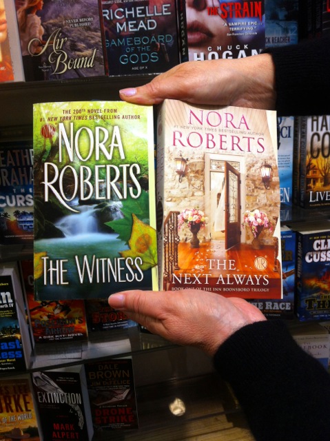 We all know that Nora Roberts is beyond prolific. (The Witness is her 200th book.) But the woman seems to have paid no attention to the concept of branding her covers so readers instantly know it’s a Nora Roberts book just by its appearance. I guess when each new release will hit the New York Times best-seller list regardless of what the cover looks like, you don’t need to care.
But for us mere mortals, who are working hard to establish a publishing identity, branding via cover design can go a long way to draw regular readers.
How can you develop a signature look to your covers? With the cooperation (or instigation) of your publisher, it’s not as hard as you might think. Here are three ways to brand your covers:
1. Always use the same font for your name. Glancing over at Ms. Roberts’ covers, you can see that no such branding has occurred. The only attributes the two bylines have in common are that her name is in all caps and both fonts are san serif (don’t have curlicues on any of the letters). The fonts look very different, and convey a very different feel. You’ll want to find a font that can work regardless what category any of your books might appear in. (Nora’s two titles that I spied nestled up next to each other on the store’s shelf are romantic suspense (the book on the left) and pure romance (the book on the right).)
2. Select a color range. Maybe you’ll decide to focus on cool colors, maybe on warm colors. (Ms. Roberts’ covers clearly are opposites.) The question becomes what feeling do you want to convey with your covers?
3. Create visual similarities. You might want to concentrate on having a watercolor feel to all of your covers; or maybe you use black and white photography on all your covers. Deciding on whether a person is portrayed on your covers or not is another way to establish a point of commonality on your covers. Once again, it comes down to what feeling you want your covers to convey.
AUTHOR BEWARE! These design concepts need to be created in coordination with your publisher. Never tell your publisher, “Purple is my favorite color; so I want it on all of my covers.” Your favorite color bears no weight as a rationale for a cover design. Colors are chosen to convey a feeling to the reader, not to please the author. The same goes for the font. A san serif font communicates a feeling of being straightforward and clean-lined. A serif font is actually easier to read and communicates complexity (in a good way). Don’t come up with your own idea of how to brand your covers, but work in concert with designers and marketers who have a much better idea of what sells.
Also, keep in mind that styles come and go in covers just as they do in clothing. Don’t be locked into a look that isn’t fluid.
One of our agency’s clients, Cynthia Ruchti, has been working with her publisher, Abingdon, to brand her books. Here’s a peek at what her novels’ covers look like with their coordinating redesign:
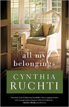
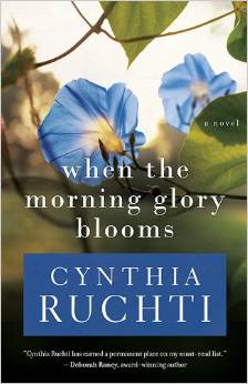
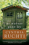
In what ways do these covers establish a brand for Cynthia?
What author can you think of whose covers convey the same feel again and again? What creates that branded look?
Does branding make sense for you? What would you like to see as hallmarks of your branded covers?
TWEETABLES
3 ways to brand your covers. Click to tweet.
Does creating a specific look for covers help to market books? Click to tweet.
I suspect your local bookstore is selling old stock, because if you look those Nora Roberts books up on Amazon, you’ll find the Kindle covers have more similarities regarding font and look.
Maybe she’s recently rebranded? It happens … I’ve got all Robin Jones Gunn’s Glenbrook series, and there are three distinct looks to the covers.
Lola, well, I was at an airport bookstore, and I would think they have pretty steady turnover of books; so that’s puzzling. If I look up these two specific titles on Amazon, the covers I showed are the covers Amazon has as well. I think she has chosen to brand her romantic suspense and pure romance with two different looks.
Robin Jones Gunn’s Glenbrook series was repackaged at least three times, maybe four. So the look changed, but Robin has a specific font for her name that is used on every cover for the past 8 years or so. It can take time to evolve into a branded look, which is why I wrote about it. An author might not think in those terms from the first book on.
Good information, Janet. Thank you. I wouldn’t have thought of branding covers.
James Herriot is one of my all-time favorite authors and the covers of his ALL CREATURES GREAT AND SMALL series definitely were branded and conveyed the main subject of the book: Veteranarian James, against a Yorkshire Dales background, either holding or surrounded by animals. Even James Herriot’s biography (written by his son) has Herriot sitting in a field, petting his Jack Russell Terrier. The author’s short story collection series (e.g. James Herriot’s Favorite Dog Stories, James Herriot’s Cat Stories) have a uniform appearance as well. Each has a (cute) picture of the animal on the bottom 2/3 of the cover and a block of color on the top 1/3/ with the title (of course Herriot’s name is in the title).
Again, I’ve never been aware of branding (shame on me!) but as soon as you explained it, those covers from Herriot’s first series sprang to mind. I had to check out his other books online to see if branding continued after the first four books.
Thank you for giving another important insight into publishing and marketing books. 🙂
I LOVE Herriot!! Our family collection of those books was almost loved to death! If we could hear laughter in the house on a rainy afternoon, we knew Herriot was involved.
I’ve often thought of Tricky Woo when I take my fuzzball dog for a walk. My sister and I fought over who was going to marry Tristan Farnon. 😉
Oh, I definitely wanted to marry Tristan. I rather liked James as well, but he liked Helen so….
In regards to Tricki Woo, the official James Herriot site has a wonderful slogan: “Making Flop Bott a household word since 2002.” 🙂
I never get tired of reading his books. My favorite episode (other than the stories about James’ disastrous dates with Helen)is the one when Tristan is put in charge of the pigs and forgets to close one of the gates. Actually, it’s a tie between that and the time he had to lance a boil on a vicious sow–but got the job done!
I hope you didn’t get any damage from Arthur. My sister and brother in law are still down here this summer so they were worried about their house (which got wrecked already by the floods back in May). Thankfully, according to neighbors, no further damage was done by the hurricane.
I hope you and your family (including your fuzzball) have a safe and happy summer.
Aww, thank you for asking, how sweet of you! Well, Arthur kind of nailed us! No power for 6 days, thankfully we had water, many didn’t. No phone for 7 days. We almost lost a 30 foot weeping willow, but it stayed standing! My husband, being a tree guy, has been doing some (ha! hours and hours of it!) chainsawing for the neighbours. My perennials got flattened and ripped apart, but they stayed rooted, so they’ll be back next year.
I did A LOT of reading!
I’m so sorry to hear the misery the storm caused. From what you said, I assume you have power and phone back. My sister talked to her neighbors last night and they said,”Power to the People” meaning that they had finally gotten their power back, but they still have no phone service.
I’m glad to hear that you didn’t lose your willow tree even though your perennials got smashed 🙁
You got in some reading? Yay! So there’s an upside to everything. 🙂
Very interesting topic, and the examples are great.
I do have a question – for a debut author, would the publisher regard any conversation about branding as somewhat pretentious?
My first thought is that the publisher would pick the best possible artwork for visual attraction, and that any possible branding considerations would be pretty far down he list.
And, therefore, subsequent books would essentially have to work within the framework that was already established by the ‘career launch cover’ to maintain branding?
I love Cynthia Ruchti’s covers…but they look like titles within a series, at first glance. Is this a good thing, even if the books are stand-alones?
Good questions, Andrew. I think it would be appropriate to mention to the publisher of your first book, that you’d like to have a long writing career and a branded look from the outset. That would mean avoiding an outlandish font that might work well on, say, a fantasy book, but would be downright weird on a Christian living book.
Cynthia’s novels aren’t a series, but the branded look does encourage a reader to think of them as a series. No harm is done in creating that look for standalones.
Janet, Interesting and thought-provoking post that sent me looking at the covers of my books, designed by two different publishers. Although I never noticed it before, my name is in the same font on all of them. I know that my publishers have been good about letting me have input on cover design, but now I’ll pay even more attention to it. Thanks for the post.
You were fortunate that both of your publishers showed brand awareness when designing your covers. Sometimes even one publisher will ignore what a previous cover looked like and create something totally different for the current book.
A question – I have noticed that covers for hardcover and softcover editions by the same author often appear quite different.
I assume that this is a result of the different size, and therefore the different visual impact each format imparts from its position on a shelf.
If branding more importantly maintained with a format, or do you feel that a branding style should be designed to apply to all formats?
Since most books are displayed in stores ‘spine-out’, I would think that consistency of spine design is vital. Is this correct?
I’m surprised that you found new designs for softcover vs. hardcover releases of the same book. Publishers don’t tend to do two different designs since they want the visual to be consistent from format to format. It costs the publisher quite a bit to do a new design.
Spine designs are a related but different topic; they’re very important since the spine often has to do the work of a cover when the book is on a bookstore’s shelves. Consistency of design pays off here as well, although not as significantly since bookstores are unlikely to carry every book you’ve ever written.
Janet, another fun and thought-provocative topic!
First, I love, love, love Cynthia’s “branding.” I like how Abingdon has done Cynthia’s name in colored blocks at the bottom of the cover. Already, the reader knows what to expect when she looks for Cynthia’s books. AND I’m big on color–the eye appeal of the colored blocks is not only attractive, but the blocks coordinate beautifully with various colors in the cover elsewhere, too. So well done! The covers draw me in and make me want to read more.
Another favorite example (of course, you know I must mention) is Debbie Macomber. I’ve read Debbie 20+ years and I’ve known from Day 1 what I could always expect. Here’s a link to all her fabulous books that I recommend friends peruse: http://www.debbiemacomber.com/books/series. If folks look at the various series, they’ll notice a uniformity of each book and series selection. Debbie’s “brand” and book covers are unique. They make me feel “at home.” I want to slide up next to her and dig into a big, ol’ piece of apple pie!
I hope to evoke a Heartfelt, Homespun feel in my books. I’d like my books to have the similar sensation as when they visit my website. (Hats off to the fabulous Kelli Standish! *waves*) I’d like the background of my covers to give the reader a feel for the Ozarks and the feeling of “coming home.” Oh…and RED is my favorite color. Maybe we could work that in somewhere. 😉
Cynthia, I just bought Debbie Macomber’s book, The Shop on Blossom Street. Starting Chapter 9. Do you have a favorite? I had to interrupt the reading to dig into Heather Gilbert’s Miranda Warning. I read all weekend … finished it … couldn’t put it down!
Shelli, I have to admit I’m a huge Debbie Macomber fan so I love everything she writes. I especially enjoy her Christmas stories, with Mrs. Miracle being one of my favorites. Did you see it when It was on the Hallmark channel about two years ago as a movie? Ahhh.
Cynthia, apparently a Mr. Miracle is a possibility for a future Hallmark moment.
I did not see that, Cynthia … I’ll look for it though!
I suppose printing your books in red font would maybe NOT be a good idea?
Hmmm… 🙂
I love Cynthia’s covers, and as someone who used to spend my days framing artwork, I can say that the covers deliver the subtle punch needed and desired by the designer.
The colour box around the font grabs the undertones in the photos, draws the viewer’s curiosity and attention, then sandwiches the title in between dominant and secondary colour points. Very subdued, classical, and soothing.
Laura Frantz’s covers are a triple layer dessert buffet for the eye. Lush, LUSH colours, the gowns are just perfect (for my wrist) and the art is exquisite. Ahhhh.
After seeing the cover of Lori Benton’s Burning Sky, I loved the Mohawk basket. Since then, I’ve often thought of having the image of a little Navajo wedding basket on the spine, right next to the title of my books. And perhaps incorporating Navajo weaving somehow.
Jennifer, I’ve not heard what drew you to Navajo. I’d love to hear that one day! 🙂
Oh but Jennifer, the first thing I think of concerning the Navajo is their exquisite turquoise jewelry. Could you somehow include that in your cover??
OH! You’re right!! SILLY me!!
Thank you for the reminder.
Laura Frantz’s novels were the first I thought of, Jennifer…they are truly beautiful, and really capture the sweep-you-away-into-the-past feel of her stories.
And I love the basket on the cover of Burning Sky too! And your idea of incorporating a Navajo wedding basket (or jewelry) in yours. 🙂
Covers. My heartbeat. Gawsh I buy books based on covers alone, so I’ve been dreaming of my own book cover branding. Since my historical romance is thick with suspense, I picture my covers having suspenseful elements. Dark blues, moody reds, etc. Whatever reflects the location. Heroine profiles maybe cut off above the nose so you don’t see their eyes but their stance is defensive, pensive, startled, or wary. Of course my name should be in bold red ’cause that’s my favorite color 😉 I worked that into my proposal as a must-have (KIDDING!)
Jaime, I like the way you’re thinking about the mood the colors create. Colors evoke so much, and we don’t always give them adequate credit for the hard work they do.
Um, yeah, be sure to mention that red is your favorite color in your proposal. That’ll win over a lot of publishing votes.
Forget judging a book by the cover; recognize the auther by the cover.
And Jennifer, I’m taking your phrase “almost loved to death” and applying it to a few of my books, including James Herriot’s.
Why, thank you! You could apply that phrase to my Donny Osmond albums as well.
I had a culturally diverse upbringing. 😉
I still read James Herriot. Are you still listening to Donny?
Umm. NO.
For real.
Janet, your post made me take a look through of my Goodreads list so I could answer your questions.
As I scrolled through, I realized that consistency in visual marketing really builds trust in a reader. If I like the way an author writes, I become loyal to them, and the visual cues that their covers give help immensely.
Authors who deliver lush historical fiction that trembles with romance:
Tamera Alexander
Marina Fiorato
Laura Frantz
Deanne Gist
Robin Lee Hatcher
Julie Klassen
Siri Mitchell
Sweet romance centered around family and a memorable locale:
Jan Karon
L. M. Montgomery
Janette Oke (will never forget the first printing of the Love Comes Softly series)
Awesome Regency romance:
Georgette Heyer (enough said)
Atmospheric suspense in decrepit houses full of secrets (oh, my):
Victoria Holt (a prevalence of girls running from houses with lights in the windows)
Kate Morton
Simone St. James
As a side note, these are the kinds of covers I would love to have for my own historical suspense books someday.
As a child, I remember seeing my mother’s Agatha Christie books strewn around the house. All the covers looked the same. But now I know why she kept reading. The branding, and the fulfilled promise of another outstanding mystery kept her coming back for more.
Does re-branding help an author who has had less than ideal sales? Would a publisher be willing to do this? If so, what might spur them on?
Thanks for the rundown on different types of covers per genre and what they convey, Jenni. Very informative.
Rebranding can help stalled sales, but publishers generally won’t make the investment until the author comes up with a stellar new idea that puts wind in sales’, um, sails. (Talk about a clogged up analogy…) Until the publisher has reason to believe sales can be revived for older titles, the investment in new covers won’t be made.
I’m self-pubbing a series starting this fall, and I want my covers to be themed and branded to me.
My favorite font that I use for everything is Georgia, so I had my cover designer use Georgia for my name. I’ll stick with it for everything I self-pub, no matter who the cover designer is.
For this series there will also be one element that shows up on every cover. I’m still mulling over the second and third covers to see how I want to do them.
Sounds like solid thinking, Rachel. You also might think of drawing on the continuity from the color wheel as well.
This is another fascinating discussion. From my viewpoint, the rebranding is almost a settling into the brand I already was, but finding new ways of expressing that. As someone else mentioned, we readers subconsciously register an affinity for books with a cover that silently speaks of a previous book that was an enjoyable or gripping read. I believe these covers give a sense of depth of story, not lighthearted but with Hope that the unique interplay of light and shadow represents, a “classy” feel to the cover, but on the other hand also very real, which I pray is represented within the covers, too. Although there are romantic elements in my novels and sometimes a reference to something historical, they’re not romances or historicals. They’re clearly contemporary with strong emotional elements. I personally think these covers hit that mark perfectly. They’re evocative in the best possible way. I’m working now on developing new business cards and stationary that match that feel. The team at Abingdon Press worked hard to get this right. I couldn’t be more grateful.
Cynthia, thanks for your behind-the-scenes glimpse into what you and the Abingdon team hoped to convey. I think you succeeded beautifully.
The thing I’ve noticed about Nora Roberts books is that her branding is consistent for each genre she writes in. Her futuristic J.D. Robb books have one look, her mainstream romantic suspense has another look, and her paperback romantic series have a third look. I suspect the difference in the branding is due to the different genres. I wonder how much crossover she has in readership among those three groups.
Leigh, good point. I do have to say that I did a double-take in the bookstore since she had two books on display, sitting next to each other, and they communicated such opposing messages. I wonder, like you, how much crossover she has between genres. I would think quite a bit, but I don’t know.
I’ve noticed a personal preference (again, totally mine…sure folks disagree)! Many of the covers I’m drawn to don’t show the characters’ faces. Maybe they are hinted at: a shadowy side-profile, or the protagonist’s back to me, or just a coy close-up (perhaps a snapshot of her hands clutching a tattered purse?). Something about not forcing the issue, not painting a cunning picture of the character’s impossibly perfect nose…leaves me free to do some of that wonderful co-creating as a reader. You know, adding the extra helping of freckles, limp hair, over-plucked eyebrows, and all the wonderful imperfections that make these made up “people” somehow more relatable…and more real. 🙂
Becky, I’m with you on leaving more to the reader’s imagination and instead going for conveying the feel of the book on the cover.
(I’ve seen authors that do this in their stand-alone books, and the effect is wonderful moody…very soulful!)
I love everything about this post. I noticed recently that all of Gillian Flynn’s novels are strikingly similar. Kate Morton is another that pops into mind. And early John Grisham. I’m not sure anymore, but his books used to look very similar. You can spot them on shelves and know who wrote them.
I have definite ideas in mind for what I hope to be the look of my brand and this makes me realize I need to keep those colors and fonts in mind when designing my new author website. In fact, I would probably design the website based on the colors and style of my first cover whenever that happens.
Angela, you’re absolutely right that your website and covers should bear a close resemblance to each other. Fonts and colors can go a long way toward achieving that.
“You can spot them on shelves and know who wrote them.” Angela Mills, this is so good. What a wonderful goal. I not only want covers that express this, but to write stories readers can trust will deliver a high-impact experience. Whether they spot the cover similarities or the name of the author, how magnificent if readers can trust it’s a story worth investigating…worth pulling off the shelf and exploring!
Thanks Janet! Another post to save for future reference…And I LOVE Cynthia Ruchti’s covers!
Fascinating. Thanks so much for sharing.
I’ve noticed that Brandilyn Collins’ books have a very distinct cover.
Besides the front cover, some authors books look the same when they are sitting on a shelf. Kristin Higgins is a good example of this. A reader could probably go right to her books.
Cynthia’s covers are great. Each cover is inviting even before you read the blurb.
Great post today.
Jackie, Brandilyn is superb at branding and understands how to remain true to her tagline, Seatbelt Suspense.
Ninie Hammon is a fiction writer I worked with last month on her conversion. I think she has a very successful branding strategy for her covers (by DogEared Design —not me). What do you think? Is this what you’re talking about?
http://www.niniehammon.com/
Mark, yes, Ninie’s books do have a branded look. The font and the colors all feel connected. I can’t tell if her novels are part of a series, all have the same protagonists, etc., or if they’re standalones in a specific genre. If they’re connected, the artwork should have been more consistent, in my opinion. But the covers are each strong in its own way.
Janet,
What an absolutely fabulous post! It is so helpful to see the examples and the styles you portray here.
Cynthia has a feel of going home on her covers. The text font, color schemes, and lighting is all similar. Also, I notice that it matches her green couch she often uses in her publicity photos. Green offset with vibrant colors. Love this covers and her books!