Blogger: Michelle Ule
Sitting in for Wendy Lawton, who is out of the office today.
A friend of mine loves Harry Potter books.
Actually, with her degree in English, Leah loves all good literature.
(No jokes.)
She’s a bibliophile–she loves books. Not only for their stories, but also the physical holding and owning of a book.
Leah and her husband plan to take their first vacation this summer, and they’re going to her dream spot: England.
I asked her what she’s going to purchase for a souvenir while she’s there, and she had a fast answer: “For me, the complete set of Harry Potter books. I love the British covers.”
I laughed. I brought her back a copy of a Harry Potter book purchased in Oxford several years ago. Now she wants to round out her set.
“Buy them in Dublin [the final stop on their trip],” I advised. “Books are heavy to haul around, and you should pick them up the day before you return home.”
“Ah,” she said with a twinkle in her eye, “but they’ve got a different cover in Ireland.”
I hope I haven’t tempted her into buying 13 books!
Harry Potter looks different the world over. Here’s a link to the different versions.
In addition to English, Harry Potter novels have been translated into 73 other languages. You can even buy Harry Potter’s story in Latin!
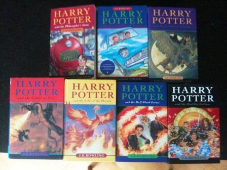
He’s even had a makeover in the British versions. The original versions, published by Bloomsbury are elemental and reflect what Bloomsbury though they were publishing: children’s books. The first two, in particular, look like something a nine-year-old would read:

As the phenomenon grew, they covers became slightly more sophisticated, as befitting Harry’s age.
The versions I purchased in Oxford looked more abstract:

You’ll notice Harry himself doesn’t appear in the more recent versions.
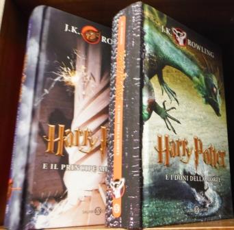
While traveling in Italy last month, I saw Harry Potter books were among the few children’s books on the shelf at a bookstore. I was amused at how different they looked:

That’s Harry Potter and the Half Blood Prince on the left and Harry Potter and the Deathly Hallows on the right. The original Italian versions reflected the juvenile tone of Bloomsbury’s:

Harry Potter, of course, has been read all over the world. When we visited New Zealand in 2002, his books were practically the only thing available for children in the bookstores. As our daughter had read the Potter books early on, we were looking for other books and visited bookstores all over the country. I finally asked a bookstore owner, “Do you have anything besides Harry Potter?”
“That’s what everyone wants to read,” he answered.
“But what will the kids read when they’ve finished all the Harry Potters? There’s a lot more children’s literature out there!”
He shrugged.

Our foreign exchange student from Brazil taught herself English from reading Harry Potter books.
“I read the first one,” she explained, “with the book in one hand and the dictionary in the other. By the time I bought the last book, I could read it easily.”
Her copies obviously used the original Scholastic covers published in the U.S.
I bought this book for my niece for her birthday one year, just before she left on a trip. Can you guess which country she visited?
It worked beautifully. When a friend from that country visited her the next year, she spent a lovely summer day engrossed in a magical world using words she knew from birth!
You can purchase foreign translations of the Harry Potter books online.
Leah loves the beautiful lines of the Bloomsbury second edition. The serpent on the cover of Harry Potter and the Chamber of Secrets glows in the copy we’ve got here in California.
It’s interesting to me how the different countries emphasize different aspects of the story while retaining some similar characteristics–that serpent, for example.
Early in the books’ career, some adults were embarrassed to be seen reading a children’s series. Some hid the books behind a magazine or even put a different book jacket on top.
Perhaps looking to make the books more adult-friendly, another version came out in the UK:

Here’s my question: which set do you like the best and why?
Or
Which set, in your opinion, reflects the story the best?
Tweetables
Foreign covers for Harry Potter. Which do you like the best? Click to Tweet
Harry Potter covers change around the world. Click to Tweet
Who saw an adult version of the Harry Potter books? Click to Tweet

Michelle,
Thanks for this trip around the world – I was feeling stuck sitting at my laptop during Spring Break week!
I love the more whimsical look of the Italian covers. I think that by portraying a more innocent Harry, it gives greater contrast to the darkness of the evil characters and shows Harry’s vulnerability.
To me, cover art is often more influential in my book choice than are blurbs from other authors (I always assume the publisher made them do it). I still LOVE a book that has an illustration at the start of every chapter!
On a happy note, in my work with Lilybell magazine, I have now had the joy of seeing a few of my stories come to life through illustration. Last week I was scrolling facebook and saw some original art posted and realized it was the illustration for a summer fiction I submitted to Lilybell – what a shock.
I wonder if illustrators know how special we think they are?
Note to Michelle – wow! You get around!
Good point, Sheila, remembering Harry was just a boy when the series began. (And as a parent I’d often think, who in their right mind would send their child to a school like Hogwarts?).
I agree, it’s fun to see how an illustrator interprets your story. Boy’s Life Magazine (boy scouts), once illustrated a story I wrote with a drawing of a scout leader–she certainly had a much narrower waist than me! 🙂
Sheila, I agree with you about influential cover art. The image the publisher uses to portray the story within really does show their awareness of reader expectations.
I had no idea there were so many different covers for the Harry Potter books! Does this only happen with bestsellers, or do most books that are published in different countries get a unique cover design?
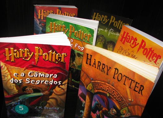
I like the Portuguese covers. They’re colorful and it seems like they hint at the elements between the front and back covers.
I’m with Sheila. You have done a lot of traveling! I guess the military can do that, eh? 😉
Hi, Jeanne. A Dutch publisher released a Dutch translation of my debut novel with a different cover. The title is slightly different, too: Where Love Lives instead of Where Treasure Hides. (Very exciting stuff for a newbie author!)
That’s cool, Johnnie! How exciting for you! And congratulations!
Johnnie, below, describes what happened with her book. I’m guessing here, but the copyright would extend to illustrations. I don’t have a foreign copy of HP with me right now to check on the interior, but yes, when a foreign publishing house buys the rights, they design their own covers.
Interesting, though, on the Portuguese version–those covers look just like the US Scholastic ones, so perhaps they just modified them.
Travel–I grew up in a family that traveled, it’s our joy. The Oxford trip, however, was in conjunction with research I was doing on my WWI story. I wrote about that trip on my own blog, here and the HP covers were depicted!:
http://michelleule.com/2013/11/12/travelers-tales-oxford-walk/
I like best the adult friendly UK covers (I wish the US would have them too). Why, because I am an adult and I would feel funny reading in public a book that has a cover that was kid friendly when I don’t have any kids.
I’m with you. I liked the look of the adult covers the best. I wonder if they were edited differently . . .
That’s really interesting, my reaction to the adult covers was a total Blah. Looked boring to me. But perhaps that is because I read a lot of kids books all the time. For my own reading and to my 3 boys every night. I am attracted to a well done, kid friendly cover, so perhaps I’m not the best judge. I’m thinking I must see these books through kids eyes or something.
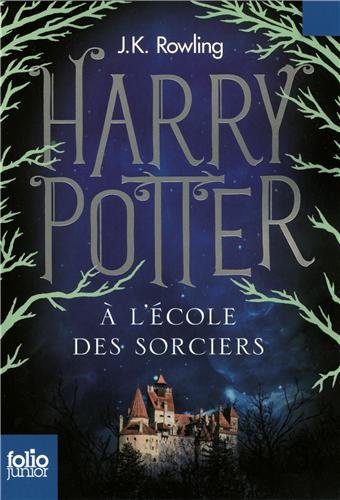
I like the look of the French and Italian covers.
But, I wonder what the French Canadian covers look like, compared to the Continental French ones?
Michelle,
Thank you for this great post shows how important covers are, not only in reflecting the story but in addressing cultural concerns.
My favorite covers of the ones you presented are the recent adult UK versions. I came to the Harry Potter series late (well, about 2003). A friend of mine, a librarian, knew I loved fantasy and was particularly fond of stories about Merlin from Arthurian legend. She told me I’d love HP and that J K Rowlings descriptions were exceptional. On her recommendation, I immediately went to the library shelf and flipped through one of the books (the first one, I think). My reaction was “This is a children’s book and descriptions are simplistic.” What was my friend talking about, I wondered. From that moment, I became a HP snob and would have nothing to do with the series. Then my father died and I spent every weekend watching funny movies with my Mom to try to cheer her up. One Saturday the video store (back when there were Blockbusters) had practically nothing left to choose from. I saw Harry Potter and the Chamber of Secrets and tried to ignore it. Ultimately, it was the only thing we hadn’t seen that we would even consider watching. I asked my mom, “Do you want to try this?” She said, “Sure.” So we did and we were both hooked. I was amazed at the depth of the story. Mom and I went back the next day to get Harry Potter and the Chamber of Secrets then I started reading the novels. The story arc and the moral lessons taught over the course of the series are wonderful. I recommend the series to everyone. I know some Christians are turned off by the sorcery but the books themes are quite Christian and very powerful.
At any rate, although HP is considered a children’s book series, it definitely has a lot to offer adults and the new UK covers might attract a new audience. It’s a shame that the New Zealand bookseller only had Harry Potter books. You’re question was excellent. These books have gotten children hooked on reading. Once that hunger is stirred, it needs to be given more to consume in order to develop life-long readers.
I hope you had a wonderful Easter!
Christine, my oldest daughter says that the first book wasn’t written nearly as well as the others. She could tell that the author had improved with time and writing. 🙂 Ha!
As far as covers … for any book, I like the hardback without a jacket. Beautiful colors in all assortments, with only the name of the book on the binder. I think they are beautiful.
Shelli, your daughter is quite astute! How old was she when she made this observation?
I do think the stories improved as the series went along, but as a reader who writes, I felt that the later books, especially 6 and 7, could have been edited more for streamlined storytelling. I got bored in places. It seemed by that point that no one was going to tell J K anything. There were too many subplots for my taste. I thought Steve Klovis, the screenwriter for the movies, did an excellent job of paring the plots down to what was really important. The only subplot I ever missed in the movies was one from the fifth book, Harry Potter and the Order of the Phoenix (I believe that’s the right book, but maybe it’s in the sixth) when Hermione goes on a campaign to free the house elves.
I agree that hardbacks are beautiful and, for me, the title on the binder is a must!
Christine, she only started reading the books about a year and a half ago … so she was 15. I was unsure of letting her read them or see the movies for a while … I waited till she was older. And actually, it was my husband who bought the first movie or two … then I was hooked and went and bought the remainder. 🙂
This was one of those times where we watched the movies first, then they read the books.
Jeanne, it was wise to check out the movies and to wait before letting your daughter read the books. I think the first two (maybe the third) are fine for younger readers (say 11), but they get darker as they go on. I know as an adult I had difficulty with watching Valdemort torture Harry in the fourth movie. At the same time, I don’t remember being as disturbed by some of what happens in the last book as I was in seeing it on film. Perhaps my imagination isn’t as graphic. 🙂 I did find, however, Professor Umbridge’s sadistic treatment of Harry in the fifth book at least as disturbing in the book as in the movie. I am not a parent, but if I were, I definitely would not want my child to read from the fourth book and up until the age of 14 or 15. As I’ve said in other comments, I think the series has wonderful messages and themes (and great characters) and I would highly recommend it to anyone, but I do find the child abuse (from Harry’s uncle as well as from Umbridge and Voldemort) uncomfortable at minimum and some of it is quite disturbing. Child abuse, however, is a reality and I think it’s acceptable to depict it in a YA book. I don’t think it belongs in MG.
You’re right, Shelli. While JK Rowling’s writing improved as she went along, the books became thicker and IMHO were not well edited. She’s famously said when she finished the series she was going to go back and edit the books and clear up the discrepancies (you can’t have that many rabid fans without them picking up problems).
As far as I know, that hasn’t happened yet.
I listened to the first book on tape while driving one day and was amazed all over again at the creativity in descriptions and names.
In my opinion, however, Harry got away with too much. One of those adults should have followed through on their threats–other than my personal favorite Snape, of course. 🙂
My blond boy has just launched himself into the world of Harry Potter and is in love. I think the original U.S. covers are great, but we are getting the newer Scholastic covers that form a castle on the spine when they all stand up together. They are oh so beautiful. Fanciful and yet thoughtful all at the same time. Oh how I love these new covers! They have a more exciting scene depicted on the front, coupled with an emotional or thoughtful scene on the back and one quote from the book that really pulls out the theme. So nice. I love seeing covers of the same book from around the world. Thanks so much for this post Michelle, I love it! So fun.
The new Scholastic covers sound fantastic, Kristen!
This is the set I would want. What a fun idea about the castle on the spine.
I’m always a bit disappointed with cover art, because it never matches my imagination. I want my books to come in a plan brown wrapper–or better yet, finely textured leather.
I’m always disappointed when it’s obvious the artist didn’t read the book. Really, how hard is it to get the hair color correct?
Well, that’s the in-house editor’s fault. Someone had to sign off on that art.
I think those hardcover Italian copies have striking covers. I remember taking my daughter to Barnes & Noble to pick up one of the later books as she was working her way through the series. She then refused to buy it because the cover art wasn’t right. It didn’t match her others. It took us a few tries to get the one she wanted. I couldn’t tell you which version she has, but she was determined that they should match.
Completely understandable–for some of us! 🙂
HP is a benchmark for me, now, when I travel and visit bookstores. I’m always curious to see what the books look like–hence the reason I took a photo in Belpasso, Sicily three weeks ago!
Those first two books WERE written for younger kids; the books grew with their audience. (I only know this because I did an in-depth analysis of the writing a couple years ago. Amazon doesn’t reflect a change in age range but I think the verbiage on the dust jacket might, I’d have to look.) As far as the covers go, I don’t think anything can hold a candle to the Mary GrandPré -designed covers we had here in the US. They were gorgeous then and still are. My British friend brought me a British book (book 4: Red at the top, blue spine, illustration of the dragon) the month it was released and it’s just boring and old-fashioned. There’s too MUCH art sized down to a physically smaller book (but much fatter; uncomfortable to hold) so that the detail—and I’m sure it’s there—is lost (crappy printing too). In general, I don’t think the Brits do a very good job of book covers. Those adult covers are nice enough but they look like covers done in this country a decade (or more) ago.
Those adult covers ARE over a decade old, for the most part!