Blogger: Janet Kobobel Grant
Location: Books & Such Main Office
What do you think is a book cover’s main function: Read this blog to get Seth Godin’s opinion.
What makes a cover so clever, so iconic, that you have to pick it up?
Here are a few covers. You tell me, do they have a Siren call that compels you to investigate further?
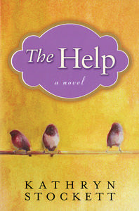
The Help
I’ve read this book and loved it. When I started to describe it to a fellow reader, she asked, “Oh, is that the book with the birds on a wire?” I call that a memorable cover. And once you understand that the story is about African American women who leave their hovels to do housekeeping and child-raising for white women in the South in the ’60s, and the cover takes on more meaning. One test for a cover is to ask, Could this cover be on a number of books, or does this cover fit this book and only this book? I’d say The Help’s cover gets a thumbs up on fitting the book well. Plus it’s pleasing to the eye. The lavender, um, cloud, with the title is a nice touch as well.

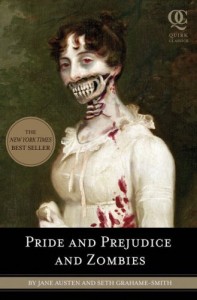
Pride and Prejudice and Zombies
I hate this cover. I’d never read this book. But I consider this cover brilliant. It’s iconic; it speaks to the audience that would enjoy this book. It’s shocking in a way to attract readers. The dark tones befit the story, and the touch of red adds to the gore-factor. The tongue-in-cheek tone of the cover tells me the book will be sarcastically witty. It is a great cover.

Julie and Julia
This cover also is a strong invitation to potential readers, with a brilliant subtitle, a clever title, and a concept that the reader can grasp through the cover alone–no other ad copy needed. For Julia Child fans, you just know the book has some connection to her. But if you know nothing about the book, the cover suggests someone named Julie took on Julia’s recipes in a small apartment kitchen. It’s a high concept with tasty implications. And the whisk used on the cover suggests humor will be a part of the work, which adds to the appeal. I rate this one simply delicious.
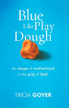
Blue Like Play Dough
The colors of this cover are so attractive and attractively used that it’s hard not to pick up. Plus, a subliminal message is conveyed, whether intentionally or not–these are the same colors used in Intel ads–with the blue dominating and the touch of orange.
I vote for all these covers, even for the one from the book I’d never touch. They emanate at least one of the qualities Seth Godin claims a strong cover should:
- iconic
- noticeable across the room
- sophisticated
- original
- clever
- funny
- generic (true to its genre)
What’s your vote? Tell us about covers that were Siren calls for you.


I confess that when I start running low on books then I join a book club to replenish my reading stock. Last night I was looking through a book club flyer and noticed that it was the cover of the books that first attracted me. If the cover wasn’t attractive to me then I didn’t even bother to read the summary. By the way – I am ordering “The Help” and if it wasn’t for the simple just stunning cover then I wouldn’t have looked further.
I have to agree. I like all these covers. However, I didn’t like The Help until you described what the book was about and then I said, “Oh, yes! That fits perfectly. Great cover.”
I have to agree with you on Pride, Prejudice and Zombies. The cover is horrible and brilliant at the same time. However, I’m…being drawn to the book. I want to read the blurb and pick it up and read an exerpt. It’s caught me that much. It’s just so…drastic.
I liked the cover for Julie and Julia before you told me what it was about. I knew what it was about from the cover, so I think that cover is absolutely brilliant.
But…Blue Like Play Dough? The cover is…I like the color of blue, but I have no clue what the book is about.
Covers are so funny! I need to go Amazon-search Julie and Julia now!
I went to a bookshelf just now to have a look at the covers. I realized when looking them over that I especially am drawn to the ones that give a hint as to the genre.
Tasteful colors do appeal to me and sophistication. Thanks for the link to Seth’s Godin’s blog. I think he hit the target with that one.
I must say, Pride and Prejudice and Zombies is a cover you love to hate.
It caught my attention at first because of its similarity to the classic. It seemed to be out of place among new releases until I noticed the gory twist. Revulsion immediately replaced interest…but then I started to snicker a bit. Who would be attracted to such a book? And suddenly several people came to mind–my 19-yr-old son chief among them. He has a dry wit and an appreciation for the macabre. I sent him the link. He pointed it out to a couple of friends who are fans of the Austen version…
Viola! Word of mouth. Conversation. And Seth Godin’s point is made. 🙂
Color is number one for me on a book cover – love all of the above covers except the zombie one because it’s dark. I might pick it up because I’d identify the image but I’d put it down pretty quickly.
I also really like a clean design. It’s interesting that these covers all have similar (two are exactly the same) fonts too.
But why is the Play Dough orange on the Blue Like Play Dough cover? 😉
Covers that made me pick up the book before hearing anything about the book: Cloudstreet by Tim Winton, Snow Flower and the Secret Fan, The Inheritance of Loss, and Embrace Me.
This is why I love going to Barnes and Nobles rather than shopping Amazon.
I’m with Teri D Smith “…that give a hint as to the genre.” I love that too. Just a hint to make me pick it up off the shelf. And as sick as the Pride and Prejudice and Zombies one is…oh yeah…that intrigued me.
I must be sick. LOL.
No. Seriously, covers are important for that initial pick-it-up-off-the-shelf moment. But the back cover blurb and first few pages have to pull me in too.
I hear yellow is an attractive color for book covers. I heard that at a marketing conference back in October of 2008 so maybe it’s changed by now, but that blue one (Tricia Goyer’s) really caught my attention, bigtime.
As far as covers, I’d vote for Tricia’s as far as eye catching. 🙂
Great post!
I like the Pride & Prejudice & Zombies cover. It’s — like you said — iconic. It’s definitely something you can’t easily forget.
The last cover threw me a little bit because of the orange Play-Doh and the blue background, like Heather mentioned. That small detail draws me in and makes me wonder if the book has some quirky elements to it that I might like. Brilliant!
I’d pick up Julie & Julia anyway because of the subtitle. It sounds like a good read. The cover is just an added bonus.
I love the elegance of the first cover. I guess I’m drawn to a book by the elegance and sophication of the cover.
It doesn’t change the fact, however, that the writing needs to be like the current in a raging river, sweeping me into the story and washing every other thought from my mind.
Valerie, thanks for pointing out the similarity in fonts on the covers; I hadn’t noticed that. Do you think that means these books are intended for the same audience? Well, we know Pride, Prejudice and Zombies isn’t–and its font is distinctive from the others.
By the way, Gina, for future reference, if you want to order The Help from Amazon, you can click on the book cover in our sidebar “What We’re Reading,” and it will take you right to that book on Amazon. Me, I’m for the most efficient way to get from Point A to Point B.
So we just need to predict what the “it color” will be for book covers in the next year or two. 🙂
Lynn, yellow was a popular choice for book covers, eh? I just cast my eye over to my bookshelf where all of our clients’ new releases reside, and I see lots of gold tones. I remember several years ago walking into a bookstore and being bombarded by lavender and purple. EVERY book on the front display used those colors. Turned out to be a good idea not to use those colors on a cover that year because those that were in the purple tones blended together. Oy vey, this cover business is tricky.
I love Tricia Goyer and when I heard she was writing Blue Like Play Dough, I was jazzed. But the cover throws me off every time I see it. The Play Dough is supposed to be blue. What they’ve got on the cover is a lump of Silly Putty, which isn’t even the same texture as Play Dough. This wouldn’t keep me from reading the book, but it’s still got me scratching my head.
When I first saw the cover I was thrown by the orange play dough, too … but is HAS been a conversation starter. A very good thing. And it’s just fun. I like that.
Actually, none of these covers would hake me pick the book up. I would pick up Blue Like Play Dough only because I know the author.
I like covers with a background containing scenery or a building, with characters in the foreground.
I haven’t read Tricia’s Blue Like Play Dough yet, but it reminds me of those tricky questions where they have, say, the word “red” done in the color green, and it throws you off, making you think about what you’re reading (instead of saying it’s red because you read the word red–ha.)
I think it was brilliant to do the cover in this way because it then makes you wonder, “just what does she mean, “blue like play dough?”
As a mom and teacher I made tons of homemade play dough,too, so it also speaks out to that sort of audience. Then you see in small print that it’s a book for mothers. Just brilliant. It hits me every time I see it!
Ha! Rachel Zurakowski has been scratching her head over the orange Silly Putty as well. It appears that bothers some potential readers and intrigues others. I personally liked that the designer didn’t go with the obvious choice of blue PlayDoh. Just gets to show how much personal preference plays a role in what we’ll pick up and what will repel or at least puzzle us.
Lena, thanks for your input on the covers. What sort genres do you like to read? It could well be that I didn’t pick a book from one of those genres.
If Lena’s describing covers like Tamera Alexander’s historicals, I’d have to agree that they’re very fetching. It’s a very different feel from the more contemporary Julie & Julia.
Wonderful article. I love hearing your thoughts on book covers. I do notice that most of the things you like require simplicity and bold colors. It makes me worry for the cover of my debut novel.
If you have the time, I’d love to hear your critique of it: http://img36.imageshack.us/img36/9474/mollyfydebook110600.jpg
Janet, thank you for these posts on book covers. It is interesting but more than that it helps me to learn about one more aspect of the publishing life of a book. Hopefully, one day I will need this knowledge for my own books.
It can often be discouraging trying to get to publication, but I find that the more I know and understand about the process the more confidence I have.
A J
AJHawke.blogspot.com
Hugh, I did check out your cover. It’s a good cover in that it suggests possible genres–sci fi would be my top guess, but speculative fiction of some sort.
It’s not a great cover because it’s trying to say too much. Why do we have the hand touching the planet in addition to the faces on the cover? Personally, I would eliminate the faces because they make the cover overreach. But, lest the designer take offense, please keep in mind I’m just one person, and as you can see by the comments on this post, opinions can vary.
I’m a visual buyer. I won’t purchase a cookbook that doesn’t have pictures of the finished product. In that respect, I like to see what I’m getting.
To that end, I have never given it a thought as to how much the book cover plays a part in my desire to buy.
Thanks for the post. It gives me something concrete to focus on the next time I’m in the book store.
Sometimes it’s easier to describe what I don’t like as far as covers go. I don’t like covers which seem to have nothing to do with the story–at least none that I can see. Through blog tours I’ve read a couple of novels whose covers didn’t do the story justice and even eluded to a different genre than the story actually told. I never would have bought the book from the cover design and the back cover copy, but the story was so much better than the blurb and worth reading.
The zombie cover will definitely reach its target audience. The other covers don’t float my boat, and I wouldn’t pick them off the shelves, although I think Julie and Julia’s cover is just right for the book.
I liked the cover of The Passion of Mary-Margaret and loved the story. Sometimes revealing faces influences how we imagine a character before we even learn about them. It’s a risk.
I actually prefer darker colors, but it does depend on the uniqueness of the design. For a while there it looked like a lot of novels from different houses selected the same designs and colors for their novels. Not a good idea, huh?
I love all of Seth Godin’s posts. As for the covers, I like “The Help” best, though I agree with whoever said they were more interested once they knew what the book was about. That cover could have benefited from a little extra text, as with the “Julie and Julia” cover.
However, since “The Help” is a novel, the title and cover would be enough to get me to look at the flap and back (as Godin pointed out).
I think the playdough book looks a bit boring. Maybe I’m just tacky and don’t appreciate the more simple covers.
In terms of book covers often looking as if they were designed by one firm, sometimes publishers do get in a rut. I remember several years ago walking into a bookstore and being assaulted by the lineup of purple book covers. It’s as if the designers all designed it was the pick-me-up color for books that year. But that just means all the books blend together. Another year, a number of covers had the same stock photo, cropped a little differently for each cover but still easily identifiable. These are the times that try publishing companies and authors’ souls.
Thank you Janet for this post, such useful advice which I shall ponder upon when choosing my book cover.
Great post. Do authors typically get to choose our book covers? Or to have input? That would be welcome and wonderful, but in my experience with four books published by the same publisher, that hasn’t happened. When the books came out I, like everyone else, saw them for the first time. Nobody asked me.
Reading your post (and Tricia Goyer’s blog at the time) makes me think I was incredibly naive. Or does this vary from publisher to publisher?
Leonore, sorry if my comment just above yours misled you. I believe authors do not have much of a say as to the choice of the cover with traditional publishers. But since I am self-publishing, I have to do it myself, that’s why I found Janet’s post extremely useful.
Actually, Lenore and Eva, authors should have a say in their covers unless they are publishing with a house, such as Harlequin, that is producing so many titles each month they couldn’t possibly involve authors in the process. I always negotiate in my clients’ contracts that they will be consulted on the cover. How publishers interpret the word “consulted” varies tremendously. Some publishers are so committed to authors approving of the cover that they try not to move forward with a cover until the author agrees. Other publishers let the author see the cover but don’t take into consideration the author’s opinion of it. As an agent, I push for the author to have a chance to give input that is seriously considered.